The Anatomy of a High-Converting Landing Page
Christine Solazzi
March 16, 2025
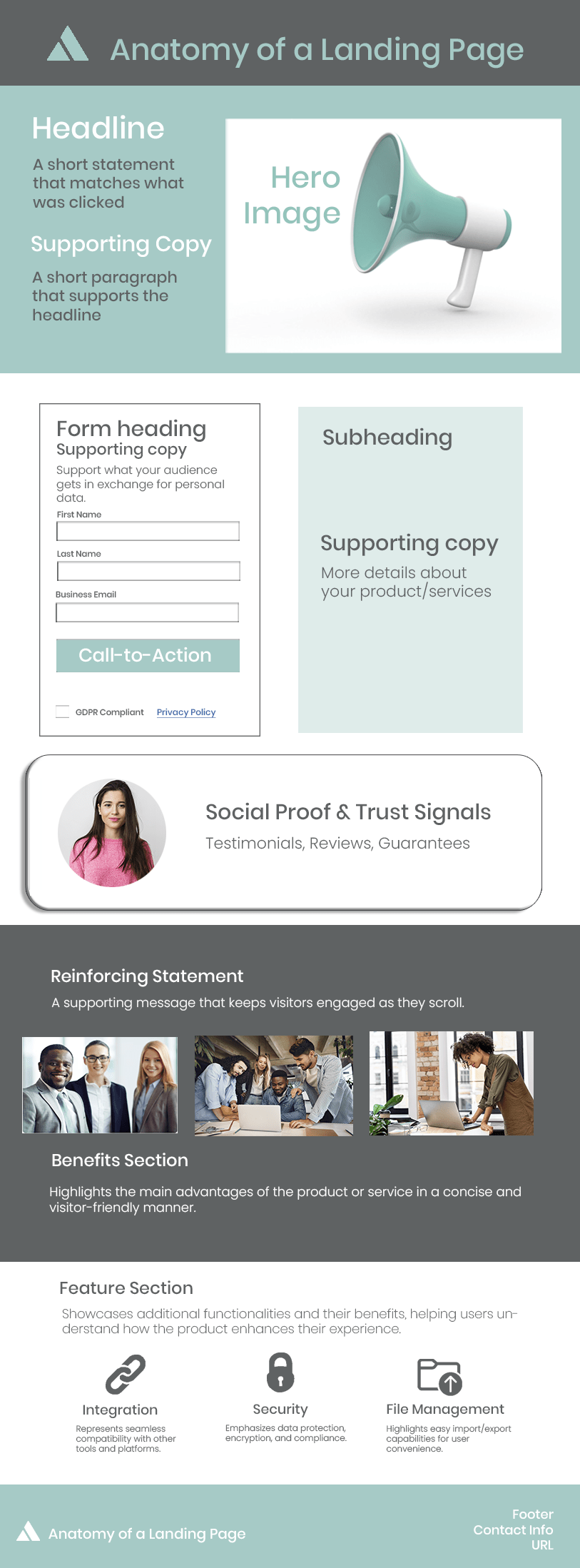
A landing page is more than just a digital storefront—it’s a strategic tool designed to capture attention, engage visitors, and drive conversions. Whether you’re generating leads, promoting a product, or encouraging sign-ups, an effective landing page must be structured for success.
In this guide, we’ll break down the key components of a high-converting landing page and how each element plays a role in optimizing user experience and conversions.
Headline & Supporting Copy: Make a Strong First Impression
Your headline is the first thing visitors see, and it should instantly communicate value and relevance.
Headline Best Practices:
- Keep it clear, concise, and benefit-driven.
- Align it with what the visitor clicked to get to your page.
- Avoid vague or overly clever wording—clarity wins!
Supporting Copy: A short, persuasive subheading or paragraph that elaborates on your headline and builds interest.
Hero Image: Create Visual Impact
A compelling hero image, animation, or video reinforces your message and enhances user engagement.
Hero Image Tips:
- Use high-quality visuals that align with your brand.
- If using a video, keep it short (30-60 seconds max).
- Ensure the media loads quickly to maintain page speed.
Form & Call-to-Action (CTA): Capture Leads & Drive Action
Your form is where visitors take action, so it needs to be simple and frictionless.
Form Optimization Tips:
- Only ask for essential information (name, email, etc.).
- Use clear form labels and an easy-to-read layout.
- Keep input fields to a minimum to reduce drop-off rates.

Use strong action words ("Get Started," "Claim Your Offer," "Download Now"). Place the CTA above the fold and repeat it strategically. Use contrasting colors to make it pop!
Social Proof & Trust Signals: Build Credibility
Trust is everything. Social proof reassures visitors that others have benefited from your offer.
Examples of Social Proof:
- Customer testimonials and case studies.
- Star ratings and review snippets.
- Trust badges (e.g., “Secure Checkout,” “Verified by XYZ”).
Reinforcing Statement: Keep Visitors Engaged
A reinforcing statement maintains interest as visitors scroll further down the page.
Best Practices:
- Use a brief, persuasive line that encourages them to keep reading.
- Highlight a unique selling point.
- Keep the tone engaging and benefit-driven.
Benefits & Features Section: Communicate Value Clearly
Your landing page should outline why visitors should take action.
Benefits Section:
- Focus on how your product or service solves problems.
- Use bullet points or icons for easy readability.
- Speak directly to your target audience's needs.
Feature Section:
- Highlight additional functionalities with icons and short descriptions.
- Explain how each feature enhances the user experience.
- Keep it skimmable and visually appealing.
Footer: Wrap It Up with Key Info
Your footer should include essential details without distracting from the CTA.
What to Include:
- Contact info or customer support links.
- Legal disclaimers or privacy policies.
- Social media icons for further engagement.
Final Thoughts: Design for Conversions
A high-performing landing page isn’t just about design—it’s about strategy. By structuring your page with these key elements, you’ll create an experience that guides visitors toward action while ensuring clarity, trust, and ease of use.