Portfolio - Pure Soap
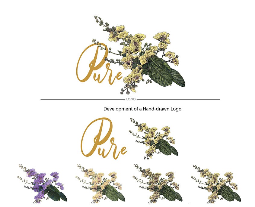
Pure Soap logo and font are hand-drawn. The process of creating this hand-drawn logo is shown in stages. The first image starts with a branch with lavender flowers. Each stage shows the progression from redrawing and painting, outlining and stippling.
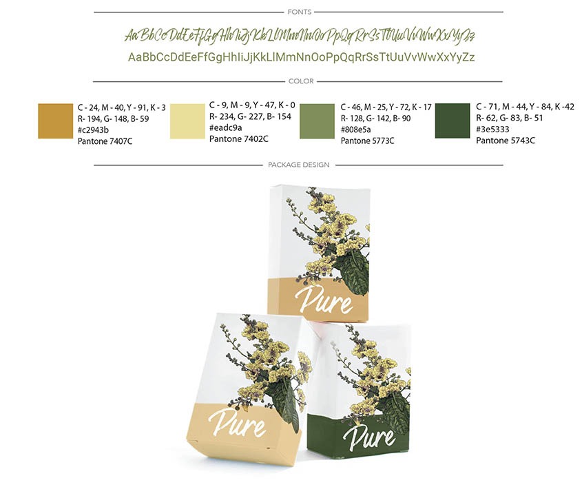
The colors are influenced by the Brand Archetype, Innocence. The Corporate Color Palette is researched and designed specifically to convey the attributes for "Pure Soap" audience. The logo conveys a mood of simplicity, pureness, good morals, and values. The Brand Archetype, Innocence reflects a wholesome, nostalgic, natural, and traditional mood.

Pure Soap embraced its unique design which elevated its product packaging adding to the success of its Brand Image and user experience.


Ready to take your business to the next level?
Mission Statement
Christine Solazzi combines her computer knowledge, expertise, education, and artistic talent to create fresh, original ideas to bring brands to life - start to finish. ™
Sign up for Marketing Tips, How to's, Inspiration and more
For more information contact Creative Brand Land at info@CreativeBrandLand.com